This New Interactive Map Shows The Exposure Sites in Your Postcode
The postcode lottery. That's how it's felt with the daily announcement of exposure sites in Sydney. It's also been pretty tricky to wade through all the information that grows each day.
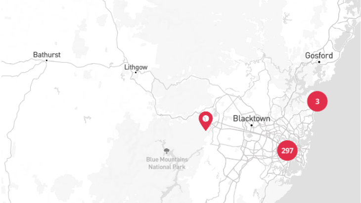
But NSW contact tracers have now created a handy interactive map which shows the number of exposure sites that are in your postcode.
The latest map is an improved version of the “heat map” released by NSW at the height of the first wave in Australia in 2020.
The original version only showed the number of cases linked to a postcode. But there's now so much more detail available.
You can check out the new inteactive map on the NSW Government website.
Sydney is currently battling the most significant outbreak of the virus in more than a year.
And on Wednesday 8 July, the two-week lockdown was extended for seven more days on July 7.
Stay-at-home orders will now remain in place until 11.59 on Friday, July 16.
Are you across all the lockdown rules currently in effect? Check out our lockdown breakdown here.
Reviews